Client
Agreau
Year
2019
Deliverables
Identity
Website
Brief
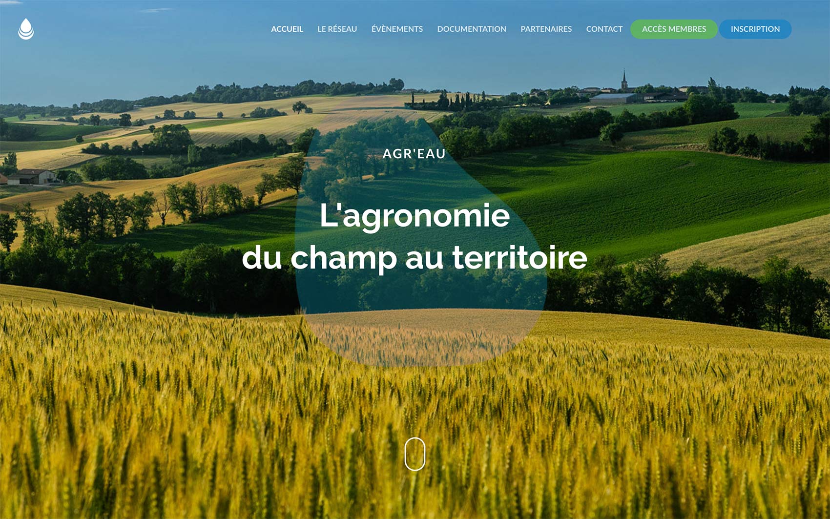
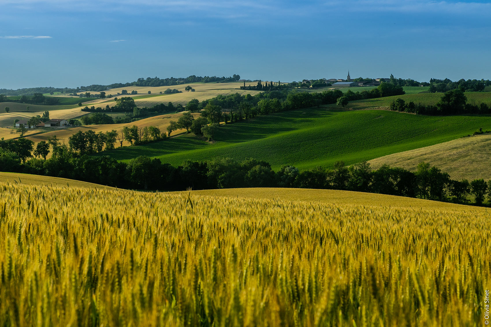
The Agreau network brings together farmers, technical structures, communities, etc. to implement agro-ecology on farms and territories.
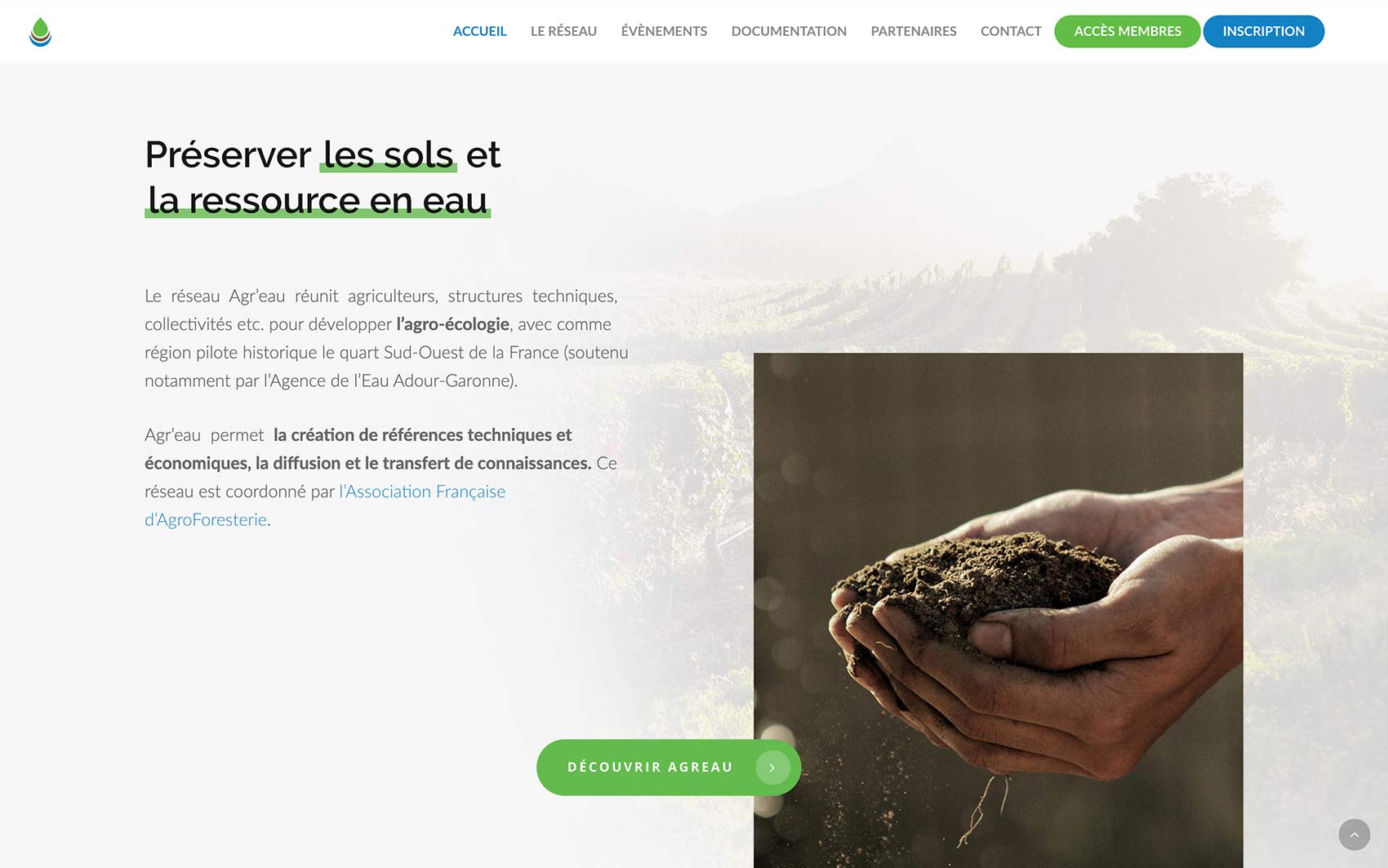
They already had a website but the rapid development of the project required a major update, in order to modernize it on the one hand and set up new functionalities (mapping of farms in particular, member area).

What we delivered
Identity
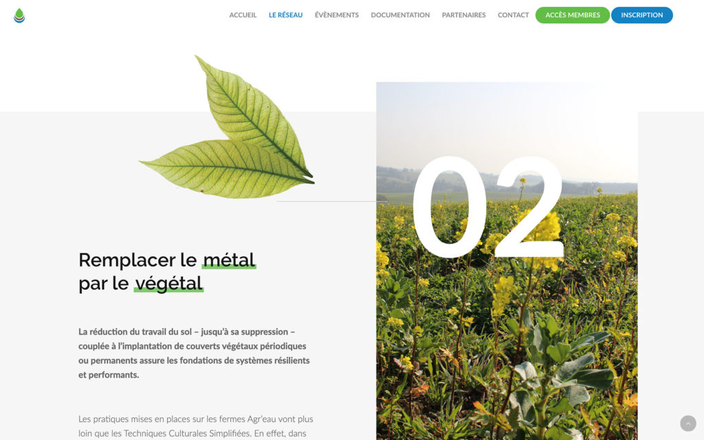
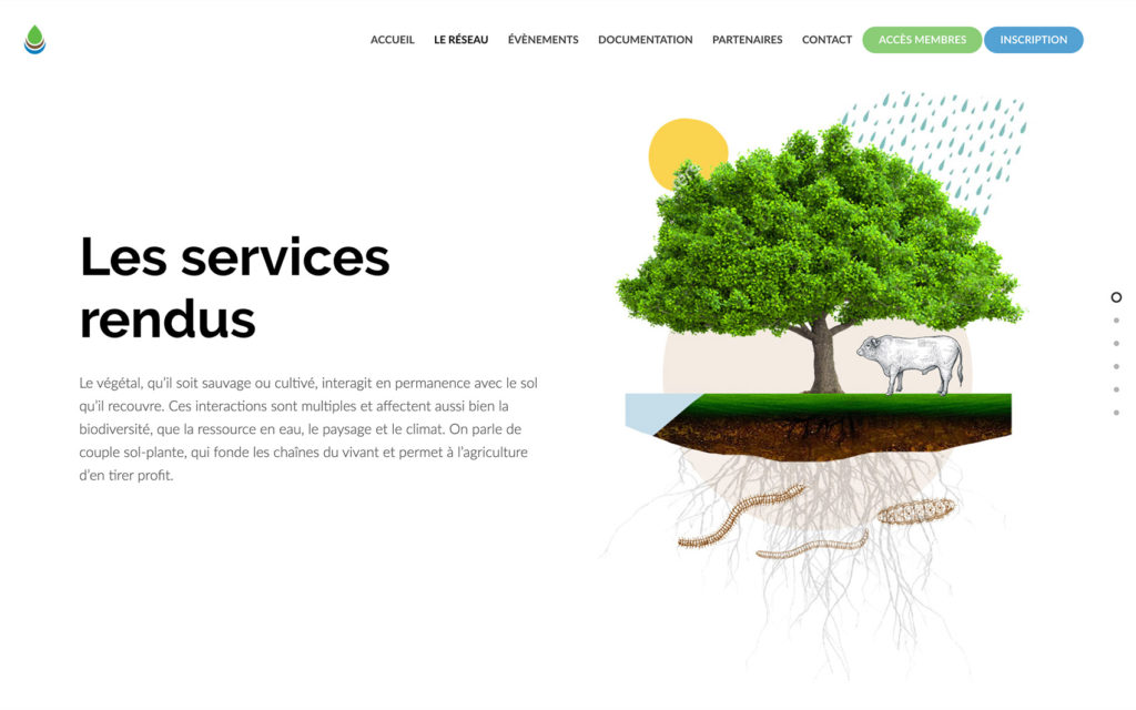
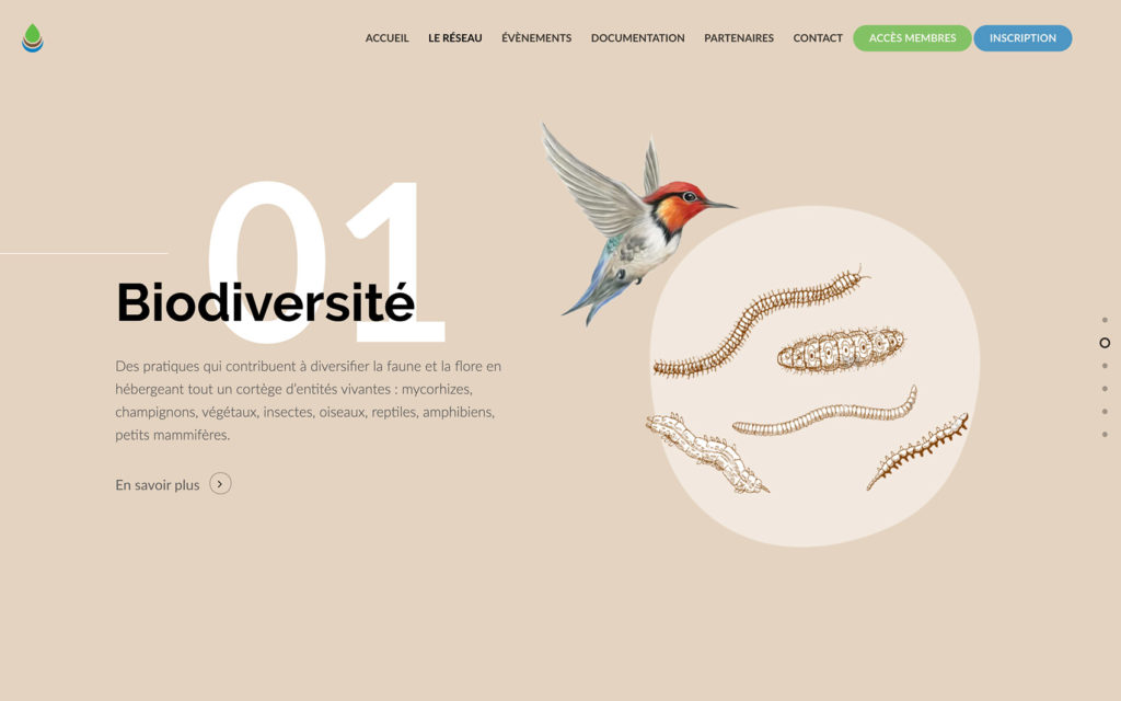
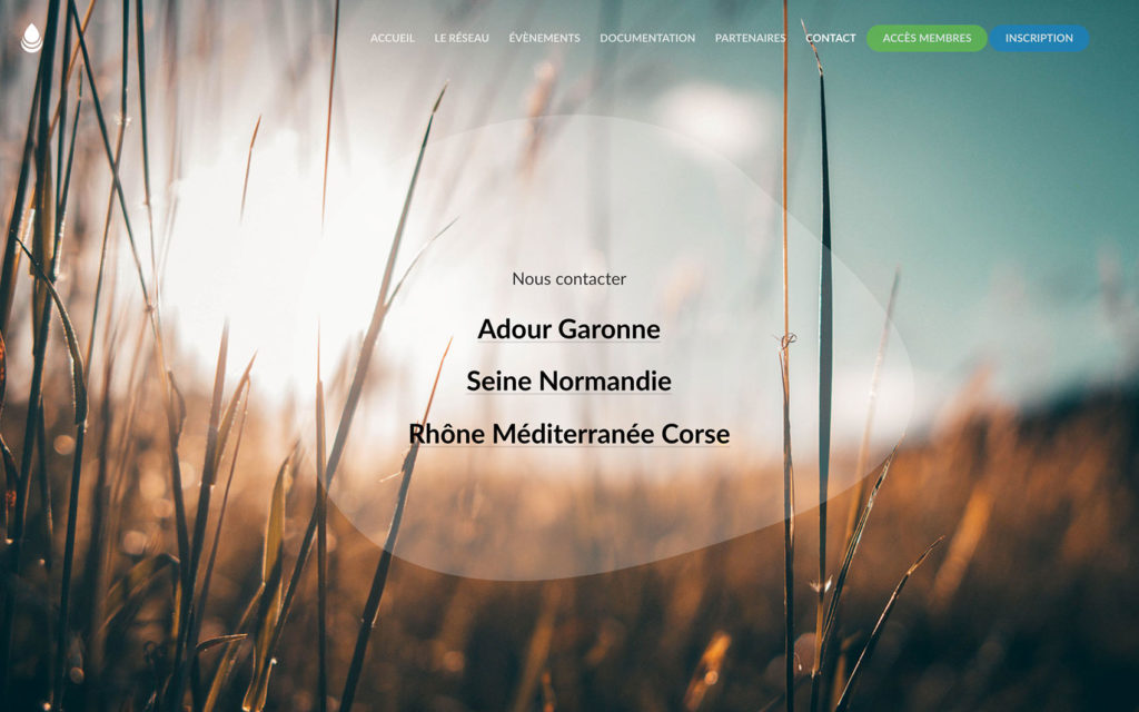
The platform now have hundred of farms that are referenced, and the can be localized on a map. Different types of accounts can be created, lots of articles are published, a whole new tool for Agreau that has a huge impact on their development now.
Logotype
As the organization most known function is to teach a new way to conserve underground water, the logotype created focus on a drop of water cut in 3 sections: water, earth and vegetal.

Colors
The colors were chosen from nature to represent the 3 elements of the logotype. The tone stays fresh and modern to dynamise the website and keep a bright feeling.
Blue
#0781be
Brown
#75563d
Green
#65ba4d
Typography
Raleway was used for the titles to get a great visual impact while keeping curves in letter, to stay close to nature and water in particular.
Raleway
A B C D E F G H I J
a b c d e f g h i j
0 1 2 3 4 5 6 7 8 9
Open Sans
A B C D E F G H I J
a b c d e f g h i j
0 1 2 3 4 5 6 7 8 9
Website
The platform now have hundred of farms that are referenced, and the can be localized on a map. Different types of accounts can be created, lots of articles are published, a whole new tool for Agreau that has a huge impact on their development now.
