Client
Ardans
Deliverable
Identity
Website
Brief
The software publisher Ardans contacted us to modernize their image on the occasion of the company’s 20th anniversary. They wanted to separate their activities as consultants and publishers by creating a site dedicated to their solutions.
They needed a new identity, which could be expressed in the software and solutions logos.

Ce que nous avons livré
Identity
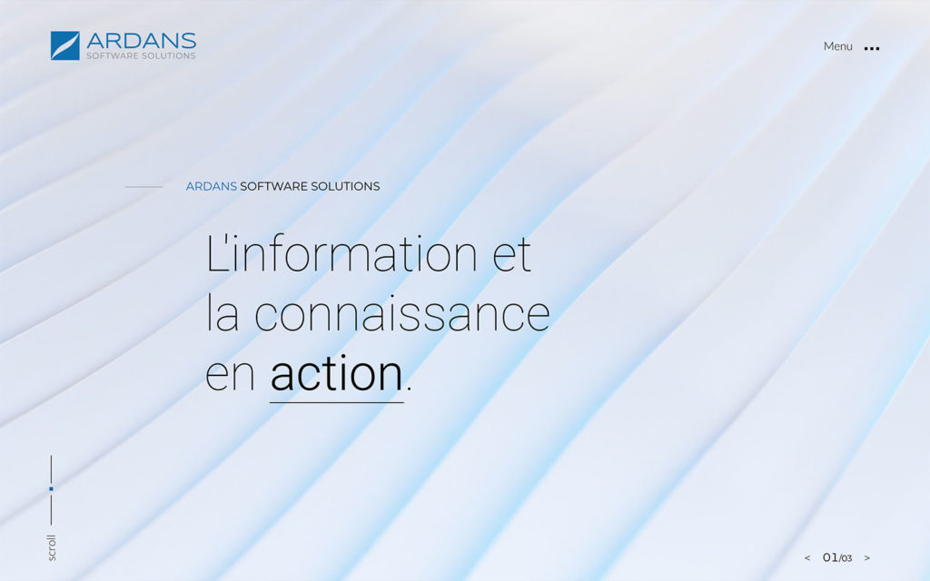
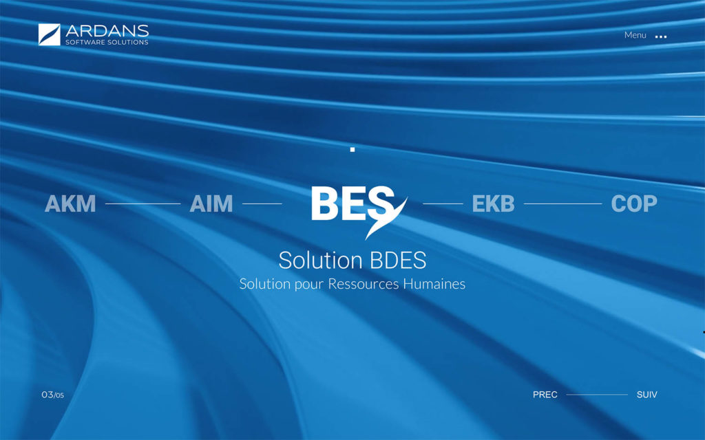
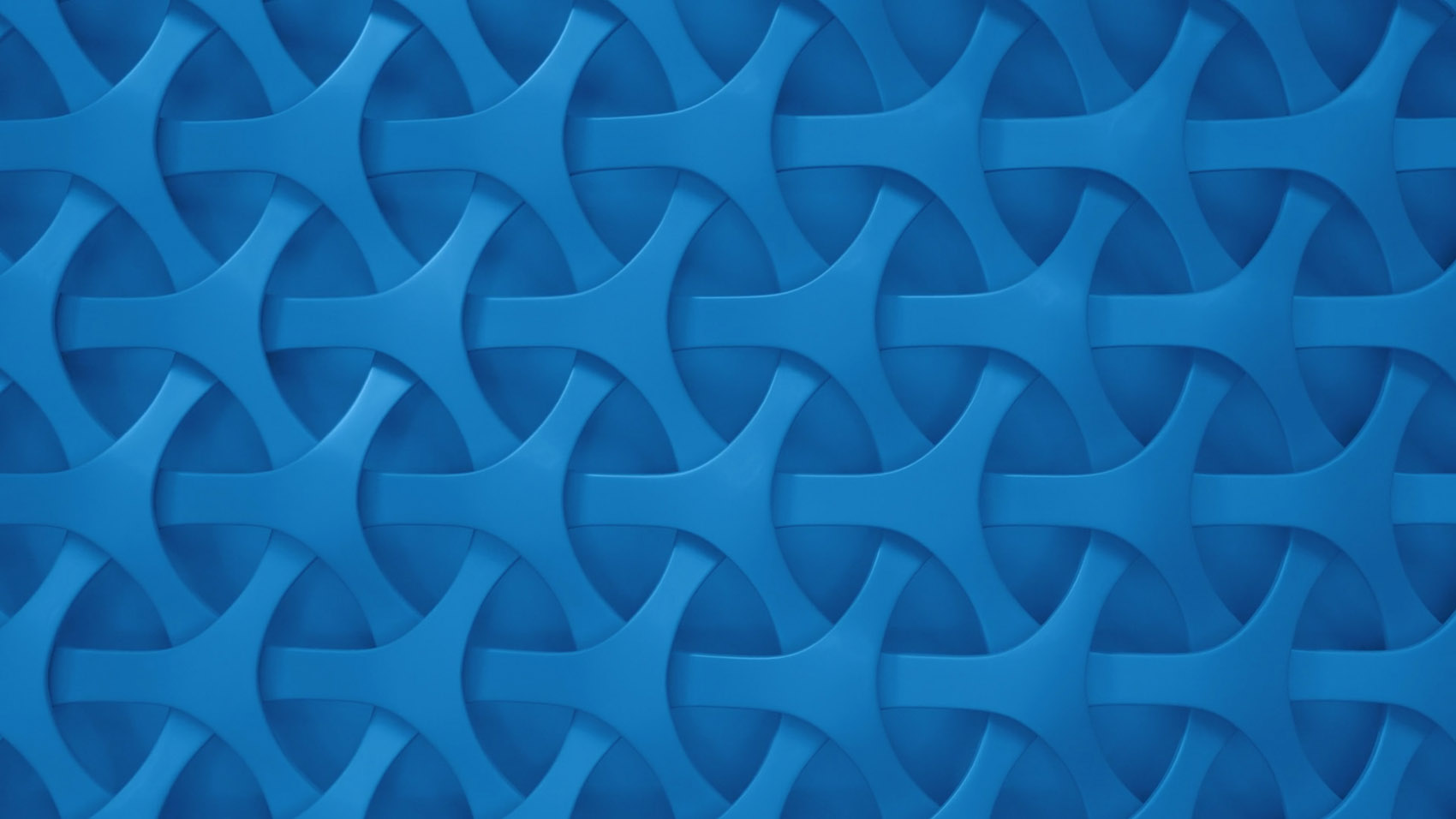
We worked on animated loops of 3D elements, inspired by geometric patterns. We wanted to merge the consistency of AI with the speed and flexibility of solutions driven by diverse users.
The color code has been simplified, as has the iconography, which has moved away from the figurative and limiting character of the old charter.
Logotype Softwares
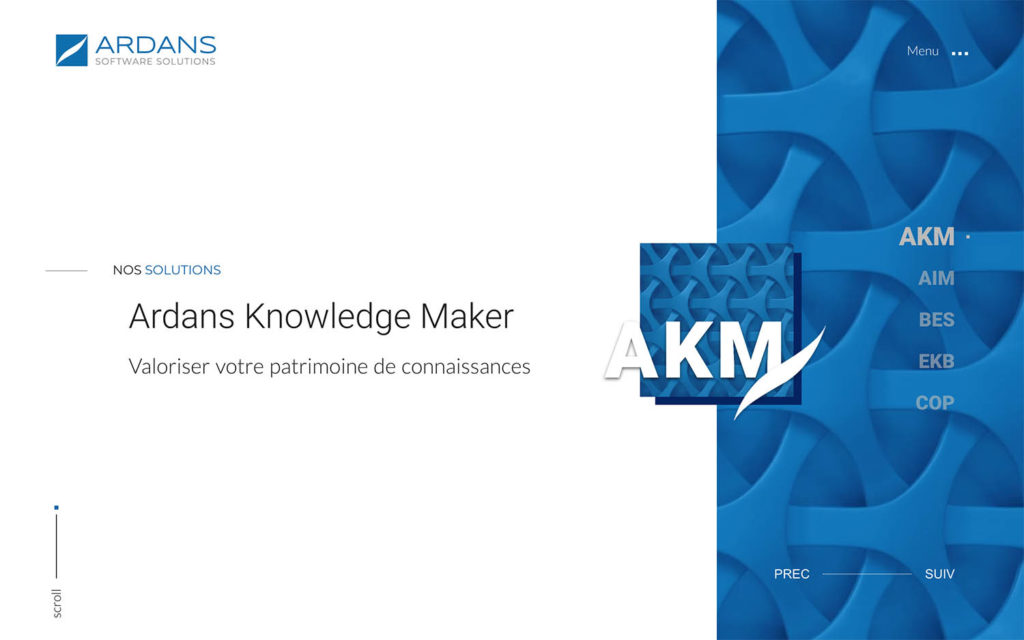
We have harmonized the logos of the solutions by reducing the acronyms to three letters.
The variation of the brand goes through the blue square and the comma, the solution being distinguished by the association of an individualized texture.

Couleurs
The identity has been designed around white, blue and black.
White
#ffffff
Blue
#0162af
Black
#000000
Typographie
Lato and Roboto, privileged fine, allow an elegant and clear content.
Our desire was to translate the quality and performance of the solutions.
Roboto Thin
A B C D E F G H I J K L M N O P Q R S T U V W X Y Z
a b c d e f g h i j k l m n o p q r s t u v w x y z
0 1 2 3 4 5 6 7 8 9
Lato Light
A B C D E F G H I J K L M N O P Q R S T U V W X Y Z
a b c d e f g h i j k l m n o p q r s t u v w x y z
0 1 2 3 4 5 6 7 8 9
Montserrat
A B C D E F G H I J K L M N O P Q R S T U V W X Y Z
a b c d e f g h i j k l m n o p q r s t u v w x y z
0 1 2 3 4 5 6 7 8 9
Website
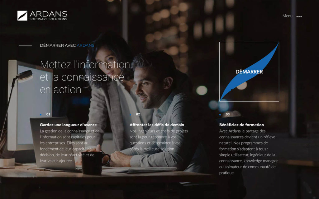
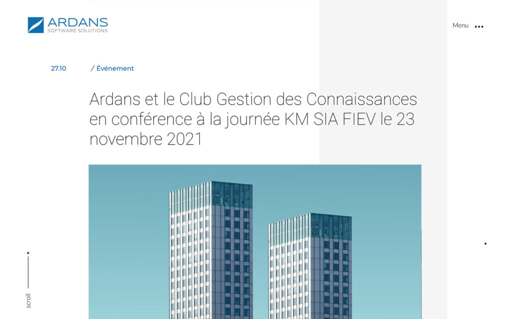
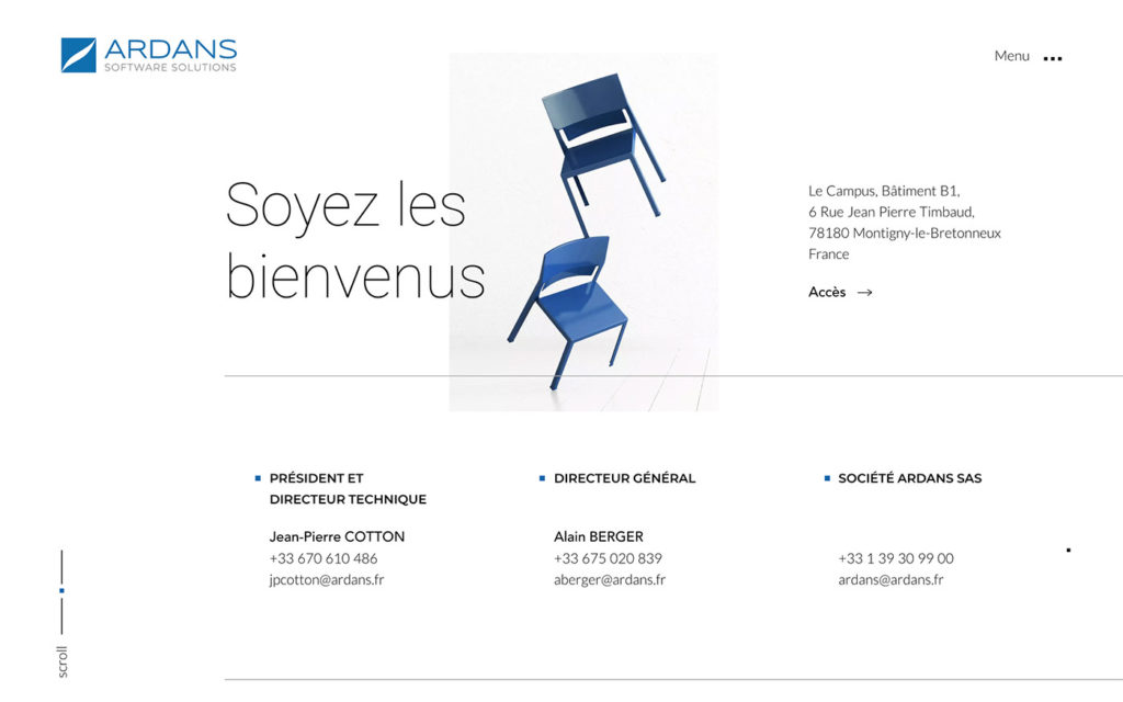
We worked on fluidity in effects and navigation. It was important for us to deliver an elegant website, in line with the qualitative positioning of Ardans products and solutions.
